Blog-A-Day Challenge Recap

If you missed any of my entries over the past thirty days or maybe just discovered my blog, here are the the links to the thirty entries posted during the Blog-A-Day Challenge I participated in:

Day 1: Brea Grant’s Blog-A-Day Challenge
Day 2: Previously… In Comics (Books Released 4/6/11)
Day 3: Whedon Wednesday: My Favorite 10 Buffy Episodes
Day 4: Break on through to the Darkseid
Day 5: Fantasy Casting: Nextwave: Agents of HATE
Day 6: “Marvelous” Massacre
Day 7: My Favorite Third Party Wii Exclusive Titles
Day 8: New Banner & Blog-A-Day Challenge Week One Done!
Day 9: Previously… In Comics (Books Released on 4/13/11)
Day 10: Whedon Wednesday: Whedonverse Artwork
Day 11: Five Disturbing Children’s Book Covers
Day 12: Fantasy Casting Daredevil: The Man Without Fear
Day 13: Self-Portraits
Day 14: Happy Easter from Spider-Egg!
Day 15: Figure Drawing
Day 16: Previously… In Comics (Books Released on 4/20/11)
Day 17: Whedon Wednesday: Marvel meets the Whedonverse
Day 18: Murals
Day 19: TURN AROUND!!!: The Latest Trend in Book Covers
Day 20: Zombie Reindeer and Other Sketches
Day 21: Thoughts on Nintendo’s Successor to the Wii
Day 22: Bin Laden and stuff…
Day 23: Previously… In Comics (Books Released on 4/27/11)
Day 24: Whedon Wednesday: My Buffy Valentine
Day 25: The Process of Reflection
Day 26: Is Doctor Who REALLY a children’s show?
Day 27: My Top Ten Favorite Comic Book Superheroes
Day 28: Painting a Mural: Step-by-Step (Part 1)
Day 29: Painting a Mural: Step-by-Step (Part 2)
Day 30: Previously… In Comics (Special THOR Edition)

Previously… In Comics (Special THOR Edition)

I’m going to change it up this week and share my thoughts on the first big comic book movie release of the year, THOR.

THOR (starring Chris Hemsworth and Natalie Portman): THOR follows virtually the same formula as the first IRON MAN film: title character starts as a jerk, is humbled, becomes a hero, and then there’s a battle tacked on the end. I don’t mean that as a criticism because IRON MAN was an excellent super hero film, so using the same structure was certainly not a bad idea.

The casting is spot-on.  This film will make Hemsworth a star. Natalie Portman, unlike Jessica Alba in the FANTASTIC FOUR films, can successfully remain smoking hot while being believable as a scientist. Kat Dennings provides a bunch of comic relief. Tom Hiddleston is the perfect Loki. The worst thing I can say, in relation to casting, is I wish Ray Stevenson’s Volstagg had been fatter.

While all the fish-out-of-water stuff on Earth is brilliant, there are a few issues with the Asgard/Jotunheim scenes that bookend Thor’s story on Midgard. All the bits in Jotunheim, the land of the frost giants, are so dark, you can barely see what’s going on. I saw THOR in 2D, so I can only imagine how difficult it would be to follow the action while wearing 3D glasses that further dim the picture. The other issue I have with the film is the final battle. I’ll do my best to avoid spoilers here, but there are two battles scenes towards the end of the film. The first makes total sense and redefines Thor as a hero. The second feels totally unnecessary.

Overall though, THOR kicks ass. The film moves at a brisk pace, it’s funny, and pretty much delivers everything you want from a summer action flick. Grade: A-

Blog-A-Day Challenge: Day 30!

Previous Previouslies:
4/27/2011 Releases
4/20/2011 Releases
4/13/2011 Releases
4/6/2011 Releases
1/21/2009 Releases

Painting a Mural: Step-by-Step (Part 2)

This is a continuation of yesterday’s blog post which you can read here.

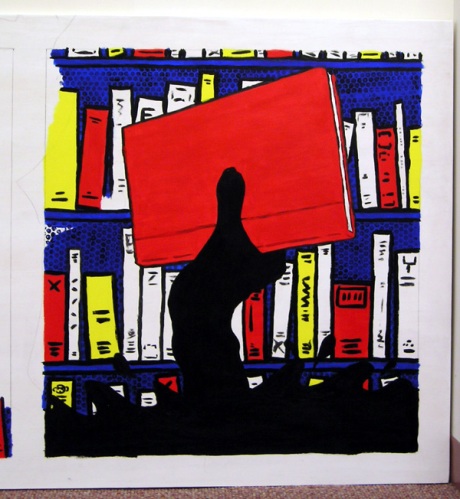
STEP 8: More black outlines. Just went back over the black outlines here. Not all that exciting, but it does start to really pull the piece together.

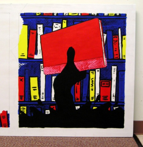
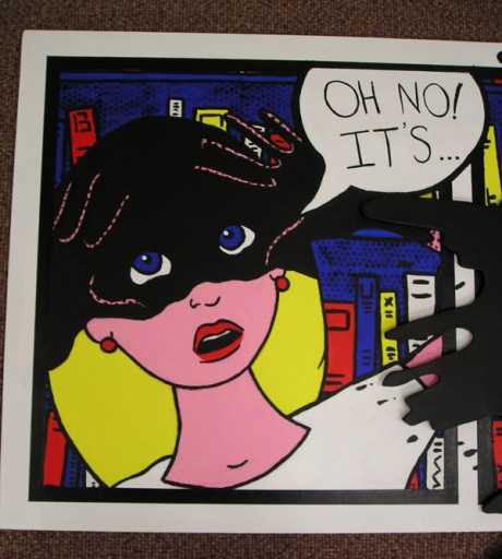
STEP 9: Painted the shadow on the girl’s hands as well as the text in the word balloon. Used bubblewrap on the spine of the book.

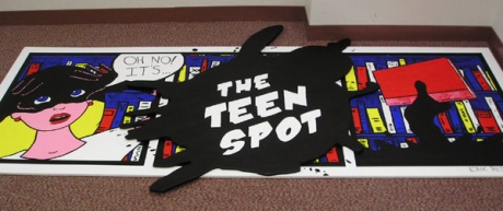
STEP 10: Text on spot. This font is actually called “Damn Noisy Kids,” I don’t think that could be more appropriate.

STEP 11: Painted in the blue books.

STEP 12: Finished black outlines. Also went over white border.


STEP 13: Painted black borders, added black splatter around spot, did various touch-ups, and signed it.

And again, the mural hanging in the library:

For comparison’s sake, here’s the final sketch I pitched to the library director before she signed off on this design:

EASTER EGGS:

A co-worker suggested I included a secret message or word in the mural, like a DVD easter egg. And at first I thought, “that’s a dumb idea.” And then I was like, “Waitaminute, this is a chance for me to show what a huge Joss Whedon nut I am.” So if you look at the spines of the books on the shelves going from left to right across the mural, there’s a B-U-F-F-Y. A nod to the greatest TV show of all time, Buffy the Vampire Slayer. And yes I am a huge geek.

I included one other easter egg. The face of the disability monkey, the unofficial mascot of the Trumbull Library. This may take some time to explain. When I first started at the library, I would often do the schedule on the white boards (especially in children’s) and then draw a picture to go with it. One week I drew a monkey with sunglasses taking a walk and a co-worker said to me, “Why is that monkey blind?” I protested, “He’s not blind, he’s just wearing sunglasses.” And she returned, “No he’s blind.” She then named him “The Disability Monkey.” I used him on more than one occasion after that. The two I included here were for our mini-golf tournament that we held in the library to benefit a library demolished by Hurricane Katrina, and then, the best one ever, the day we were showing “The Miracle Worker: The Helen Keller Story.” That could never be topped, so he was pretty much retired after that point.

Blog-A-Day Challenge: Day 29

Painting a Mural: Step-by-Step (Part 1)

In 2008, the library at which I work hired me to paint a mural for the new young adult section. The library’s teen group had already voted for the name The Teen Spot. So using only the name as inspiration, I drew various thumbnail sketches and eventually a design was chosen. Traditionally, a mural would be painted on the wall, but the walls of the library were not conducive to that, so instead the final product was painted on plywood and hung on the wall. Because I knew how involved this project would be, I decided to take photographs of the mural as I worked. This seemed as good a project as any to chronicle the step-by-step process of painting a mural. You can follow that process below, but first, here’s a look at the final piece:

STEP 1: Purchase wood. Home Depot is kind enough to cut each piece of wood once (the pieces were originally 4’x8′). The piece that would become the spot is 4’x4′. The piece for the comic strip is 3’x8′.

STEP 2: Cut out the spot. I’ll admit I had help here. My dad is much more skilled with a jigsaw than I am, so he cut it while I held it as still as possible.

STEP 3: Priming the wood. Priming takes forever, especially doing the edges of the spot.

STEP 4: Painting the spot black. It took two coats, as did pretty much every bit of this mural.

STEP 5: Penciling out the comic strip. Dirty little artist’s secret here: WE TRACE! Because the images had to fit perfectly within the panels, I used a projector to trace my original sketch onto the plywood.

STEP 6: Painting the outlines.

STEP 7: Painting in color and applying dots. This should really be Steps 7, 8, 9 and 10 probably, but I didn’t bring my camera everyday. This is two coats of paint and then I applied the dots on top of that using bubblewrap.

To be continued tomorrow…

Blog-A-Day Challenge: Day 28

My Top Ten Favorite Comic Book Superheroes

To celebrate Free Comic Book Day (go here to find a store participating in your area), I thought I’d provide a list of my top ten favorite comic book superheroes:


10. Iron Man: As a kid, I was never a fan of Iron Man. As an adult, Matt Fraction’s run on INVINCIBLE IRON MAN convinced me how awesome Tony Stark is.

9. Emma Frost: It’s not what you’re thinking… unless what you’re thinking is that, even if I can’t hear it, I still love a girl with a British accent. The only reason Marvel hasn’t brought Jean Grey back from the dead is because Emma Frost is so much more interesting as Cyclops’s significant other.

8. Leonardo da Vinci: What? You didn’t know da Vinci was a superhero? Then apparently you aren’t reading the best comic book on the stands. Go pick up the first SHIELD trade, and you’ll see what I’m talking about.

7. Rorschach: Would as many people have wanted to watch the Watchmen if Rorschach wasn’t in it? Doubtful.

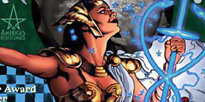
6. Promethea: Best. Origin. Ever. If you’re a writer or an artist, I can almost guarantee after you read PROMETHEA, she will have your favorite superhero origin story.

5. Nightcrawler: Nightcrawler is a tough character to write, which I imagine is why he was killed off, but when he’s written well, he’s probably the most interesting X-Man.

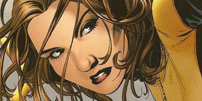
4. Kitty Pryde: I swear I didn’t put Nightcrawler and Kitty Pryde back-to-back on my list because they’re both name-checked in a Weezer song (“In the garage” from the blue album). They just really are my two favorite X-Men. And given Kitty Pryde was a huge inspiration for Joss Whedon when he created Buffy the Vampire Slayer, it’s not very surprising that Kitty makes my top five.

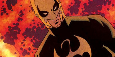
3. Iron Fist: Even before Ed Brubaker and Matt Fraction revitalized the character, I always loved the look of Iron Fist. When he finally got to star in a series by a brilliant creative team, he became one of my all-time favorite superheroes.

2. Spider-man: Peter Parker is the everyman. Do I really need to explain his place on the list? Who doesn’t love Spidey?

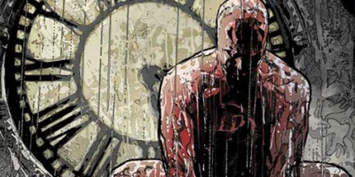
1. Daredevil: Daredevil is probably the only superhero known more for what he can’t do rather than what he can. The guy can’t see; he’s blind. Matt Murdock’s handicap makes him stronger, it’s a brilliant concept.

Blog-A-Day Challenge: Day 27

Is Doctor Who REALLY a children’s show?

I’m American, and because of that my path to DOCTOR WHO likely differs greatly from the ones taken by the show’s British audience. The first references to Doctor Who I’d ever heard were in articles about comic book conventions. A comic book website would post pictures of costumed convention-goers and inevitably there would be an individual with a long colored scarf. For a long time that’s all I knew about the Doctor, he wore a scarf, that’s it.

The current Doctor and his companions

A few months before TORCHWOOD’s season/series two premiere on BBC America, I learned James Marsters (Spike on BUFFY THE VAMPIRE SLAYER) would be guest-starring in the DOCTOR WHO spinoff’s first episode. This made TORCHWOOD required viewing, and it became my introduction into the world of DOCTOR WHO.

I watched the first two seasons of TORCHWOOD before I even considered watching DOCTOR WHO, and TORCHWOOD was most definitely not a children’s show. So when I did start watching DOCTOR WHO, I believed, like TORCHWOOD, the Doctor’s adventures were largely intended for adult viewing. Nothing in the episodes really argued against this opinion. In every episode of DOCTOR WHO, people died. People assimilated by Cybermen, exterminated by Daleks, and slaughtered by various other alien species. If the Doctor shows up, sure he’ll save the world, but before he does, a bunch of people will usually meet their maker. That’s not something we associate with many children’s programs here in the states, so I was a tad surprised when I read this quote from Alex Kingston in an interview with EW.com:

“The one thing I hope is that more children in America get on board. In England, Doctor Who has always been considered a children’s show, at least by children. My daughter and her contemporaries, they feel like it’s their show. Parents are allowed to watch but it’s the children’s show.”

Calling DOCTOR WHO’s current iteration, complexly plotted by Steven Moffat, a children’s show would be like us in the states calling LOST a kid’s show. Perhaps that isn’t the perfect comparison, but it’s pretty close. The current story arcs on DOCTOR WHO often become insanely complicated. The first ten minutes of the season six premiere had to be watched at least twice to fully understand everything that was happening. As an adult, I love when a show challenges me to keep up. But I have to imagine an 8-year old could be left mightily confused.

"I swear your kids won't have nightmares about me. Now watch as I rip this poor woman to shreds."

If DOCTOR WHO’s only crime as a supposed children’s show was to force kids to keep up with smart complex plotting, this entry wouldn’t be about questioning the children’s show label, but rather proclaiming why all children in the US should be tuning into BBC America every Saturday at 9 PM Eastern Time. But do you see that spooky looking guy above? He’s part of an alien race called the Silence and they were the villains for the two-part premiere. Also, they were pretty damn scary.

Not since the BUFFY episode “Hush” have I seen such creepy creatures on my television screen, and I certainly would never consider that BUFFY episode appropriate for a second grader. There was a chilling scene in last week’s episode, “Day of the Moon”, featuring Karen Gillan as Amy Pond visiting a rundown orphanage filled with members of the Silence. The scene was genius, but it would’ve been right at home in an R-rated horror film like THE DESCENT.

Now DOCTOR WHO does shy away from any sexual content (at most there’s a kiss here or there and maybe a line of innuendo or two) and, despite all the deaths, there never seems to be any blood, but do those things alone qualify it as a children’s show? If DOCTOR WHO didn’t have a nearly 50-year long history in the UK and the current version of the show was judged only on it’s own content rather than on what DOCTOR WHO has historically been, would any objective viewer claim this show was made for children? I can’t imagine they would.

Blog-A-Day Challenge: Day 26

The Process of Reflection

While moving a bunch of old files to my new laptop the other night, I stumbled upon the pages from my college process book. In Senior year in my Illustration Portfolio class, all Art-Illustration majors needed to create a process book to go along with their portfolio. The process book contains the brainstorming and sketches that led up to the final pieces of art in the portfolio. These pages from the process book relate to an assignment on reflection. I had to paint a watercolor piece built around a reflective object. For this assignment, I started by making a list of reflective surfaces (you can see it below, I apologize if you can’t read my handwriting). From there, I drew a series of thumbnail sketches incorporating the reflective items. The ones that are starred were the ideas I decided to expand on (you can click on the process book page, to view a larger version of the image).

Process Book: Page 1

Below you can see the next round of sketches, these were a bit more refined. It became clear fairly quickly that the image with the knife was the strongest. In the first sketch, the victim is a woman, but I thought a man getting stabbed offered more narrative appeal. Plus if I had a woman getting stabbed by a guy, when I could do the reverse, I felt like I’d be disappointing Joss Whedon. I then started sketching various possible poses for the victim.

Process Book: Page 2

Below on the third page of sketches, I’ve decided on the position of the victim and refined the image of the knife. Apparently, I was feeling extra ‘sketchy’ while working on this project, because I even drew a floor plan for how I would shoot the reference photos.

Process Book: Page 3

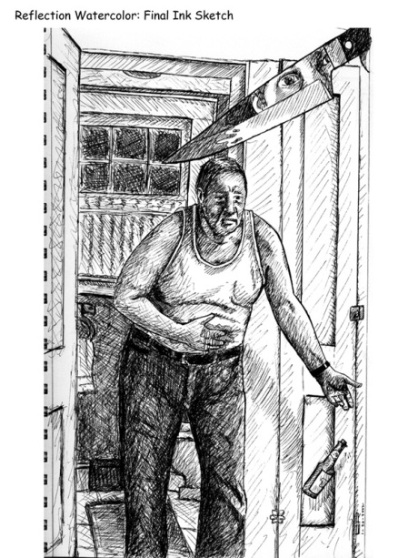
Normally, I don’t do a final sketch that is this detailed. On this occasion, because there were multiple elements in multiple reference photos and erasing on watercolor paper doesn’t go well, I decided to draw what amounts to a fully-realized pen-and-ink piece first. I then took the pen-and-ink piece and projected that image onto the watercolor paper. If you’re wondering why the victim in the piece went from a young man in the sketches to an old man in this final sketch, I was basing the original sketches around using my best friend for reference and he totally flaked on me when I needed to shoot the photos. My grandfather, thankfully, was awesome enough to step in and pose for me. I actually think using an older man as the victim adds more to the story. It creates more possible scenarios for who stabbed him and why.

Process Book: Page 4

And now here’s the final watercolor painting:

Final watercolor painting

Blog-A-Day Challenge: Day 25

Whedon Wednesday: My Buffy Valentine

One of the best parts of having some artistic abilities comes around birthdays or holidays. If I’m broke or I can’t find anything to buy, I can always draw or paint a gift for someone. Nine times out of ten, the recipient loves the homemade gift. And depending on the subject matter, occasionally there are tears of joy. While searching through an old sketchbook for this entry, I also found sketches of a Buffy Valentine’s Day card I made for a girlfriend. She may have been more Buffy-obsessed than even I was, so crafting a Buffy-themed card to go with her gift was a no-brainer. If you’re a Buffy/Angel fan, you may want to turn away now because this card is Spuffy-related.

Full page of sketches

Close-up on sketch of the card

 Before I gave her the card, I took a picture of it because I was rather proud of the end result. Now I’m wondering if there would be a market for Buffy-themed greeting cards on etsy.com.

The final card: colored pencil on red canson paper

Blog-A-Day Challenge: Day 24

Previously… In Comics (Books Released on 4/27/11)

THE MIGHTY THOR #1 (Writer: Matt Fraction, Artist: Olivier Coipel): I miss Pasqual Ferry. With THOR becoming JOURNEY INTO MYSTERY again, THE MIGHTY THOR is Thor’s new solo title debuting just in time for the hero’s new movie. Olivier Coipel, best known for his run on THOR with J. M. Stracynski, is on-board as penciller. I’m a huge fan of Coipel’s work and his previous run on THOR, but Pasqual Ferry was the perfect match for Matt Fraction’s storytelling. Stracynski’s THOR was very down to earth, Fraction’s has been a sci-fi epic. Ferry’s Kirbyesque approach to the art was the ideal fit. Apparently, Ferry will be drawing the next arc, so I don’t want to go overboard criticizing the decision to go with Coipel here, but I do think it hurts the story a tad.

This is intentionally a very accessible first issue. If you come out of the movie theater on Friday craving some Thor comics, this is definitely a good place to start. However, if you’ve been reading Fraction’s run on THOR, you might find the straightforward storytelling a little disappointing. As with any first issue, there’s a lot of set-up here, hopefully next issue we’ll see some real fireworks.

RUSE #2 (Writer: Mark Waid, Artist: Mirco Pierfederici): I never read RUSE when it debuted as a Crossgen title. Two issues into this new series, now I’m very disappointed I didn’t. RUSE has a Sherlock Holmes meets Doctor Who vibe and I’m loving it. RUSE’s male lead, Simon Archard, is a socially-inept genius who subscribes to the Whovian method of problem solving: leap off the building and then figure out how you’ll land on the way down. The female lead, Emma Bishop, is nearly Simon’s complete opposite and perfectly complements his emotionless pragmatism. RUSE’s is a tried and true formula and Mark Waid executes it brilliantly.

ACTION COMICS #900 (Writer (main story): Paul Cornell, Artist (main story): Pete Woods): 52 of this anniversary issue’s 96 pages are taken up by the main story written by Paul Cornell, so let’s start there. So often a year long story arc, like Cornell and Woods have crafted here, has fallen apart in the final issues; that’s not the case with ACTION COMICS #900. Cornell delivers a strong finale to a great Lex Luthor tale. All along, this has been Lex’s story, so even with the reintroduction of Superman into the mix, Cornell takes care to keep the focus on Luthor. We see Superman through Lex’s eyes as he tries to bring the Man of Steel to his breaking point. While I don’t want to spoil the ending, Lex’s downfall (no, shocker, he doesn’t succeed in killing Superman) is tremendously believable and in-character for the villain.

Onto the back-up stories: Damon Lindelof and Ryan Sook’s Jor-El story is probably the strongest. It’s a shame Ryan Sook can never meet the deadlines on a monthly book because his style is unique and pretty consistently gorgeous. The controversial 7-page story written by David Goyer is arguably the worst in the book. I have no real issue with Superman renouncing his American citizenship (if teabaggers thought this issue was bad, they need to read Mark Millar’s SUPERMAN: RED SON about Supes growing up in Communist Russia, I fear their heads might explode), but the story just isn’t that good. I’ve always thought Goyer was an overrated screenwriter and he doesn’t prove me wrong here.

Blog-A-Day Challenge: Day 23

Previous Previouslies:
4/20/2011 Releases
4/13/2011 Releases
4/6/2011 Releases
1/21/2009 Releases

Bin Laden and stuff…

So I had totally planned to write up an entry about DOCTOR WHO today and then last night happened. I can’t write an entry about Doctor Who within hours of Osama Bin Laden finally being found and killed. I won’t bore you with my feelings on the issue beyond “Yay! Woooo!”, I figure everyone’s got their own thoughts and most are offering them (some of mine are probably still in the Twitter feed on the right of this blog). Instead I thought I’d post two pieces of artwork. The first is the painting I was working on the morning of September 11th 2001. So when anyone asks where I was on September 11th, my answer is down in the art department at Sacred Heart University, working on my first watercolor painting.

My first watercolor painting: a portrait of Archie Bunker

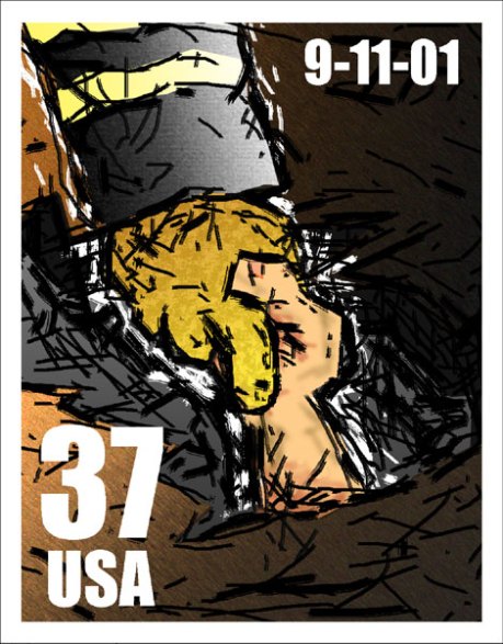
Either later that same semester or early the next, 9/11 became part of the curriculum. In my Graphic Design class, we were given an assignment to create a 9/11 memorial stamp. A lot of students were focusing on the Towers, I wanted to do something different.

9/11 memorial stamp created in Photoshop

9/11 Stampsheet